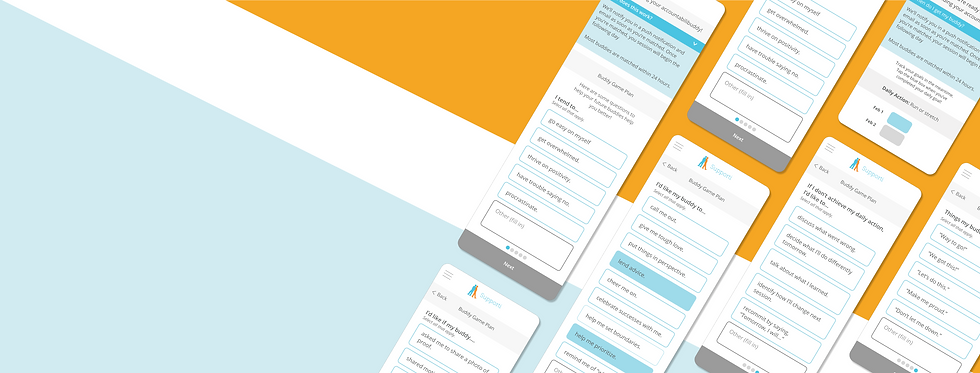
App Design: Downtime
Engagement
CLIENT
Supporti
ROLE
UX & UI Design
Product Management
Accessibility Watchdog
BACKGROUND
Supporti is a goal setting and accountability application that helps users focus on specific goals by narrowing large goals down into daily activities. Users are then paired together as "accountabilibuddies" for 7-day accountability chat sessions while they track their Daily Activity.
PROJECT
When I came on board, 34% of users were downloading the app and creating an account but then not interacting with their assigned partner. From individual user feedback, Supporti found that a lot of first-time users weren’t experienced with having accountability partners, so Supporti researched and created a PDF of questions for people to think through before they began their first session. Unfortunately, the open rates for this PDF were very low. Supporti needed a way to encourage users to access the survey, in the hopes that it would keep them engaged with the application and help them get into an accountability mindset.
Since people are more likely to take part in something that is directly in front of them, we decided to work the survey into the onboarding process itself.
This survey had previously been emailed out after users had already created their profiles, selected their goal, and requested a buddy. There is currently a downtime between requesting a buddy and starting the first session. It can typically take between 12-48 hours, which can cause people to drop off from using the application altogether. After much discussion, we decided that the new screens needed to do the following:
-
Explain the 12-48 hour waiting period
-
Encourage users to think through accountability and supply their future partners with the best ways to help them
-
Track their goals while waiting for their accountabilibuddy
1. Explain the waiting period
The solution to the first challenge was to make a landing screen following the goal setting wizard. The first iteration of this page had pretty small text that was difficult to read and didn't offer much information. Version 2 had larger text and more space to breathe, but it took up too much screen real-estate without expanding on content.
In order to include information that users had been confused about in the past but not take up too much space, I created a retractable window. To give it some hierarchy on the page and encourage users to pay attention to it, I put it in blue. We went on to use this convention in other areas in the app (darker blue bar that drops down to more information in a lighter blue box).

2. Educate users on accountability
Version 1 - Crowded & Clunky
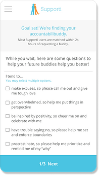
Using the aforementioned PDF survey, I initially made screens to directly reflect the PDF.
However, these screens were too small, too text heavy, and rather clunky, so I first separated each question to its own page and then added in some elements to break up the text, such as a time-selector. At the client's suggestion, I also changed from checkboxes to buttons, which are much easier for users to press with a finger.
A note on tools: I did all my wireframes in Sketch and then Figma (after advocating for the switch so the client and I could collaborate). Since my client is so visual and they weren't difficult to produce, it made the most sense for me to do fairly hi-fidelity wireframes for each iteration.


Version 2 - Buttons! Interactions!


The buttons themselves went through several iterations before reaching the final phase, aiming for maximum accessibility. While the client appreciated the look of the first style for the buttons, I wasn’t comfortable with just changing the background color in the selected state. There wasn’t enough contrast between the colors, so the accessibility of having color change being the only signifier was too low. We settled on an outline for unselected buttons and a solid color for selected buttons so that it would be much easier to see for users with lower color acuity.
However, when checking the contrast of the button colors, I realized that many of the colors used for text throughout the app did not pass AA accessibility ratings. This caused me to pursue a conversation with the client and we came up with accessible color options for all new work and simple ways to upgrade the accessibility of the existing app. These included things like underlining links rather than just signifying them by color. In some areas, such as on the bottom "Continue" buttons, the client opted for increasing text size and thickness rather than a full accessibility upgrade at this time.
Accessibility Moment


FINAL SURVEY DESIGN
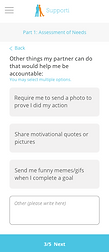
After reviewing the questions and format, the client decided to re-write the questions to make them all multiple choice. This unfortunately did away with my time-selector, but enabled me to create consistency across the survey by using the same selection buttons throughout and giving it a cleaner look overall. The same button style is also used elsewhere in the application. Yay for consistency!


3. Track goals while waiting for accountabilibuddy
Just like the survey itself, the “track while waiting” page took on several iterations. Initially, in the interest of saving time for the developers and consistency throughout the application, I pulled together designs used in other places in the app, modifying them for this particular use case. Since this was at the same time as I was creating my second round on the survey, I pulled inspiration from my first screen on the survey for the banner.
Session "Home" Page
Current Waiting Page
Version 1 of Survey
The client was concerned that this was too busy and didn’t want users to feel like they would for sure be waiting for three days. They requested that it only include one day at a time. I was concerned about this for a couple of reasons:
-
When tracking in the app, users are currently only allowed to change the tracking for the current day. If they met their goal the previous day but didn’t login after completing their goal to check the box, they were unable to fix it. This brought frustration for multiple users, so I didn’t want to duplicate that experience, and wanted users to be able to see and change the previous day’s state.
-
I wanted users to feel reassured that they would be able to track the following day even if they were not yet assigned a partner.
To satisfy all these concerns, I simplified the screen by removing unnecessary elements and updated the screen to match the current iteration of the survey. Then, I built out an interaction where the user always sees the previous day, the current day, and the following day. They are always able to change the previous day. This takes care of the pain point of being unable to fix a goal the following day as well as reassuring users that they will be able to login and track even if they are not assigned a partner yet.
Waiting Day 1
Waiting Day 2
Waiting Day 3
TL;DR
The client needed to educate users and increase engagement during a waiting period between requesting an accountabilibuddy and receiving one. They also needed a screen that allowed users to start tracking their goals during that period. I created a series of screens to inform the user of said waiting period, help the user self-educate by thinking through an accountability survey (with the bonus of having the answers added to their profile so their future buddies would be able to access them!), and track their goals during this period via a simple and reassuring screen.
During this project, I grew in my ability to advocate for things I find important, such as avoiding pain points in the tracking and working to increase accessibility across the app.